Categorical data is qualitative data, and it can be displayed visually in a bar graph. This is not the only way to display categorical data, but it's one way. It compares the number of values in each category.
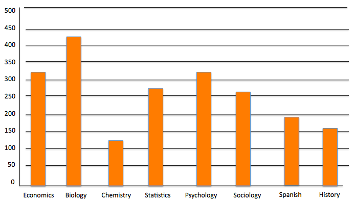
Suppose you have these courses in a college and these number of students in each course.

You begin by drawing a horizontal axis and labeling the categories beneath it. You could also label it on the vertical axis and label the categories from top to bottom if you want. So you wrote economics, biology, chemistry, and visually separated them. So far so good?

Then, you need to create a vertical axis with frequency on it. The highest number that you have is 444, which is why frequencies go up to 500.

Finally, you set up a bar that goes up to the number that corresponds to that category. So economics will have a bar that goes up to 321. Biology will go all the way up to almost 450.
The full bar graph looks like this:

Relative frequency shows how much of the whole each class represents. You can see that biology has over 20% of the students.

This is assuming that no student is in both biology and chemistry. This might not be true, in which case relative frequency might not be the way to go.
Notice that in the previous example with counts, and in this example with relative frequency, the shape and size of the bars didn't change. The only thing that changed was the vertical axis and what it was measuring.


Suppose that you have data in a table like this.

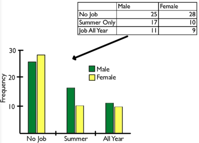
You can create multiple bar graphs on the same set of axes and compare them by category. Suppose that this was the result of a sample of 100 students and you wanted to know about their work habits. Perhaps you want to know if they were male or female, and whether they had a job, not at all, during summer only, or had a job all year long.
One way to display these items in a bar graph would be to break it up by male and female, and choose green to be males, and yellow to be females.

Then you would break the horizontal axis into no job, summer only, and job all year. Both bar graphs would be presented side-by-side, within each category. Twenty-five males had no job. The females had 28 that never had a job, etc.
What this one tells me is that males are more likely than females to have a job all year and in summer, and a little bit less likely than females to never have had a job.
That's one way to do it. The other way would be to flip-flop which category is represented by the colors and which category goes on the axis. Male and female could go on the axis, and have the job status could be the colors. In that case, it would look like the graph on the right:

The graph on the right will tell you that both males and females have a tendency towards not having a job, then have a summer job, then have a job all year. That's true for both males and females.
Source: this work is adapted from sophia author jonathan osters.