This tutorial will explain certain cautions about using correlation. Our discussion breaks down as follows:
1. Cautions about Correlation
Correlation is a statistical measure like mean or standard deviation. However, it doesn't tell the entire story. You have to actually graph the data in order to really fully understand the relationship.
Sometimes the correlation coefficient is influenced by another factor, such as:
- Influential Points
- Non-Linearity
- Inappropriate Grouping
1a. Influential Points and Non-Linearity
Recall that an influential point is an observation that, if removed, significantly changes a statistical measure. They are usually easy to spot on a scatter plot because it is an outlier.
Also, remember that correlation measures the direction and strength of a linear relationship. If a graph is curved, then it can be measured by a correlation coefficient.
-
EXAMPLE
Here are three data sets:
|
Table 1
|
|
Table 2
|
|
Table 3
|
|
x
|
y
|
|
x
|
y
|
|
x
|
y
|
|
10
|
804
|
|
10
|
914
|
|
10
|
746
|
|
8
|
695
|
|
8
|
814
|
|
8
|
677
|
|
13
|
758
|
|
13
|
874
|
|
13
|
1,274
|
|
9
|
881
|
|
9
|
877
|
|
9
|
711
|
|
11
|
833
|
|
11
|
926
|
|
11
|
781
|
|
14
|
996
|
|
14
|
810
|
|
14
|
884
|
|
6
|
724
|
|
6
|
613
|
|
6
|
608
|
|
4
|
426
|
|
4
|
310
|
|
4
|
539
|
|
12
|
1,084
|
|
12
|
913
|
|
12
|
815
|
|
7
|
482
|
|
7
|
726
|
|
7
|
642
|
|
5
|
568
|
|
5
|
474
|
|
5
|
573
|
|

|
|

|
|

|
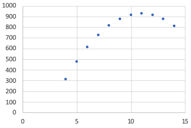
All of these three data sets have an x mean of 9, a y mean of 750, a standard deviation in the x of 3.32, and a standard deviation in the y of 203. Their correlations are also 0.816, meaning they're all linear with moderate strength.
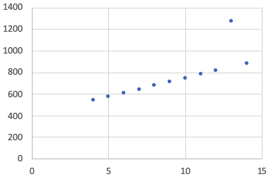
However, if we look at the three graphs, only Graph 1 is linear in the way that the data suggests that it is. One of the big ideas about correlation is that it can be affected strongly by non-linearity or influential points.
Graph 1

|
Graph 2

Affected by Non-Linearity
|
Graph 3

Affected by Influential Points
|
-
You need to not simply trust that the correlation gives you a strong number and believe then the x and the y are strongly linearly related. You have to look at the data points on the scatterplot to see if they are forming a line like that first one was, or forming a curve, or if they have influential points.
1b. Inappropriate Grouping
Another thing about correlation that can be misleading is it can also be affected by what we call inappropriate grouping. This is when the subgroups are combined together when they should not be combined. This results in a weakened, or even reversed, association.
-
EXAMPLE
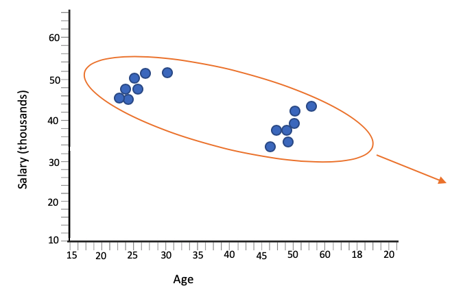
Consider the scatter plot showing the age and salary of workers at a particular factory. You would assume that the younger folks would make less than the older folks. Apparently, on this scatter plot, that's not really the case.

It appears there's a weak negative association; the longer you work there, the less you make, which doesn't really make a whole lot of sense. Typically, longevity is rewarded with higher salaries.

There might be a lurking variable behind this, where, if you look at it closely, you can see that there are two groups.
- In the first group with the younger workers, they may all have college degrees. They might have ascended to higher positions, such as a foreman rather than an assembly line worker.
- In the second group with the older workers, perhaps they don't have a college degree and have the lower paying jobs than the younger folks.
So, you might have something like this.

If you look at the two groups separately, they both have a strong positive association. The longer you work there or the older you are, at any rate, your salary will go up. However, when viewed as a whole, it appeared that the association was negative.
-
- Inappropriate Grouping
- Combining together subgroups that should not be combined, resulting in a weakened, or even reversed, association.
Correlation is a useful measure. However, like any statistical measurement, it doesn't tell the entire story. You have to graph your data because correlation can be affected by influential points, non-linearity, and inappropriate grouping. Inappropriate grouping is when you have a weakened or even a reverse association when you group, versus if you didn't group. In the previous example, when we didn't group the data, it appeared that there was a negative association, whereas when we did group the data, we found that there was a positive association. That was an example of inappropriately combining the two data sets of degrees and non-college degrees.
Good luck!


