You may recall that demand refers to wanting something and being able to afford it, as well as willing to pay for it. Thus, we often refer to demand as a willingness to pay.
Here are a demand schedule and graph for Granny Smith apples. Let's assume that at these different prices, this is how many you would purchase each week.
| Price of Granny Smith Apples | Quantity of Granny Smith Apples Each Week |
|---|---|
| $2.00 | 0 |
| $1.75 | 1 |
| $1.50 | 2 |
| $1.25 | 3 |
| $1.00 | 4 |
| $0.75 | 5 |
| $0.50 | 6 |
| $0.25 | 7 |
| $0.00 | 8 |
If we plot the points on a graph, with the price on the y-axis and the quantity on the x-axis, we get our demand curve.

Note, the relationship between price and the quantity demanded is an inverse or negative one; as price falls, you want to buy more, while as price rises, you want to buy less.
Now, each of these price and quantity combinations shows a single consumer's willingness to pay. If we were to plot this for a market graph, showing how much all consumers in total would be willing to purchase at the various prices, these figures would obviously be much bigger.
However, the question now is, what if you could get apples cheaper than what you are willing to pay for them? This is the idea of consumer surplus.
Consumer surplus is determined by the difference between what we actually pay for a good and the highest amount that we are willing to pay for that good.
So, referring back to our demand curve with apples, suppose the current price of apples at the grocery store is $1. Assuming this now represents the market versus a single consumer, 3,000 bushels of apples would be demanded, or purchased, per day at the current price of $1.
| Price of Apple | Quantity of Apples Demanded |
|---|---|
| $2.00 | 0 |
| $1.75 | 1,000 |
| $1.50 | 1,500 |
| $1.25 | 2,000 |
| $1.00 | 3,000 |
| $0.75 | 4,000 |
| $0.50 | 5,000 |
| $0.25 | 6,000 |
| $0.00 | 7,000 |
Now, there are people willing to pay more than the current price of $1. Some people are willing to purchase them for as much as $1.25, or even higher, represented within the green triangle on the demand curve below.
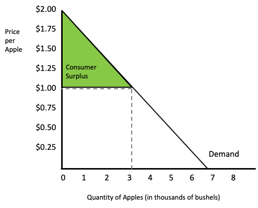
However, it is not as if the grocery store can actually charge higher prices for these people who are willing to pay more. The store cannot do that; the apples are sold at a certain price. Therefore, this is why the green area is the total amount of consumer surplus.
The square area below the consumer surplus triangle simply represents all of the revenue being spent by consumers, given the current price of apples.
Again, the consumer surplus area is the difference between what people are willing to pay and what they had to pay.
All of the people below the point of $1 and 3,000 on the demand curve are not relevant because they would not purchase at all. They are only willing to purchase an apple at a lower price than the current $1 price.
Source: Adapted from Sophia instructor Kate Eskra.