An underlying principle of capitalism is that it provides incentive to work harder, meaning if you want to improve your situation, you will be rewarded by advancing yourself and working harder.
Therefore, most Americans do not believe in 100% income inequality, or everyone earning the same amount.
This is why most Americans hate the idea of communism or socialism, where in theory, everybody has the same amount. Americans like the idea that there is opportunity for everybody to advance themselves in a capitalist economic system.
However, most people also agree that a huge disparity between the rich and poor is also not ideal. Most recognize that a healthy economy thrives when there is a strong, healthy middle class.
Therefore, measuring the extent of income inequality in a country is something that economists do, and they do this using the Gini coefficient.
The Gini coefficient is a measure of income inequality and it ranges from 0 to 1:
The lower the coefficient, the more equal income distribution in a country.
The higher the coefficient--the closer it gets to 1--the more income inequality in a country.
If we were to line everyone up in our country from the poorest to the wealthiest and stack their income in front of them, we would get a visual image, like this one from a YouTube video clip called Wealth Inequality in America:

Now, if everyone has exactly the same amount of money, this would mean that the bottom 10% has 10% of the income, the bottom 50% has 50% of the income, and so on. Basically, everybody would have the same amount of money, and it would look like this:

The difference between these two numbers--10% and 50%--is nothing--there is no difference. The bottom 10% is 10, the bottom 20% is 20, and so on.
However, we know that this is not the case in most countries. We know that everyone does not have the same amount of money.
So, here is a visual of what Americans chose as an ideal distribution, which clearly looks different, as there is income inequality.

Suppose that the bottom 20% of the population has only 5% of the overall income, and perhaps the bottom 60% has only 30% of the income.
As you can see, there is a difference between these numbers now. As we move up, people are making more and more money.
Therefore, what the Gini coefficient actually measures is the difference between these two figures, by using calculus to average them. It averages these statistics over the entire population distribution to come up with a coefficient.
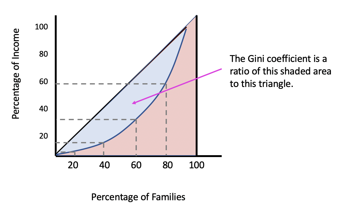
Now, the Lorenz curve is a graphical depiction of the inequality measured by the Gini coefficient.
The first step in constructing a Lorenz curve is to make a 45-degree line representing perfect income equality, with percentage of income on the y-axis and percentage of families on the x-axis.

Remember, with perfect income equality, the bottom 20% of families have 20% of the income, the bottom 40% have 40% of the income, 60% have 60% of the income, etc. This is the significance of the 45-degree line.
Let's plot the actual distribution in a country, represented by the blue curve below.

So, if all of the income in a country was earned by one person, meaning perfect income inequality, it would look like the vertical line at the 100 mark. This is because only one person would have 100% of the income, and up until that point, there would be zero income earned by all of the other people.
Now, there is no difference at all between these numbers along the 45 degree line, but as you can see, there is a curve represented.
The idea is that the closer the curve gets to the 45-degree line, the more income is equally distributed in a country, because there are not significant differences between the percentage of families and the percentage of income.
The larger the shaded area--the further away this curve gets from the 45-degree line--the more income inequality there is in a country.
This is essentially what the Gini coefficient is measuring. It is a ratio of the shaded area to the triangle formed by this hypothetical, if one person in the country earned all of the income.
Here is a visual image showing global Gini coefficients.
Note that countries in shades of blue are countries with lower Gini coefficients. The darkest blue has the most equal income distribution, or more income equality.
The countries shown in shades of red are countries with higher Gini coefficients, with those in the darkest red having the most income disparity.

Source: Adapted from Sophia instructor Kate Eskra.