Table of Contents |
Some of the most commonly used graphs in statistics are bar graphs, histograms, line graphs, and scatterplots.
If data is represented on the wrong graph, it may convey information in a way that’s not useful, is confusing, or is even misleading to those reading it. Take a look at the graph below showing the S&P 500, a major stock index that fluctuates every day that the market is open. The dates shown here start on December 1, 2014, and continue to November 30, 2015, one full year.
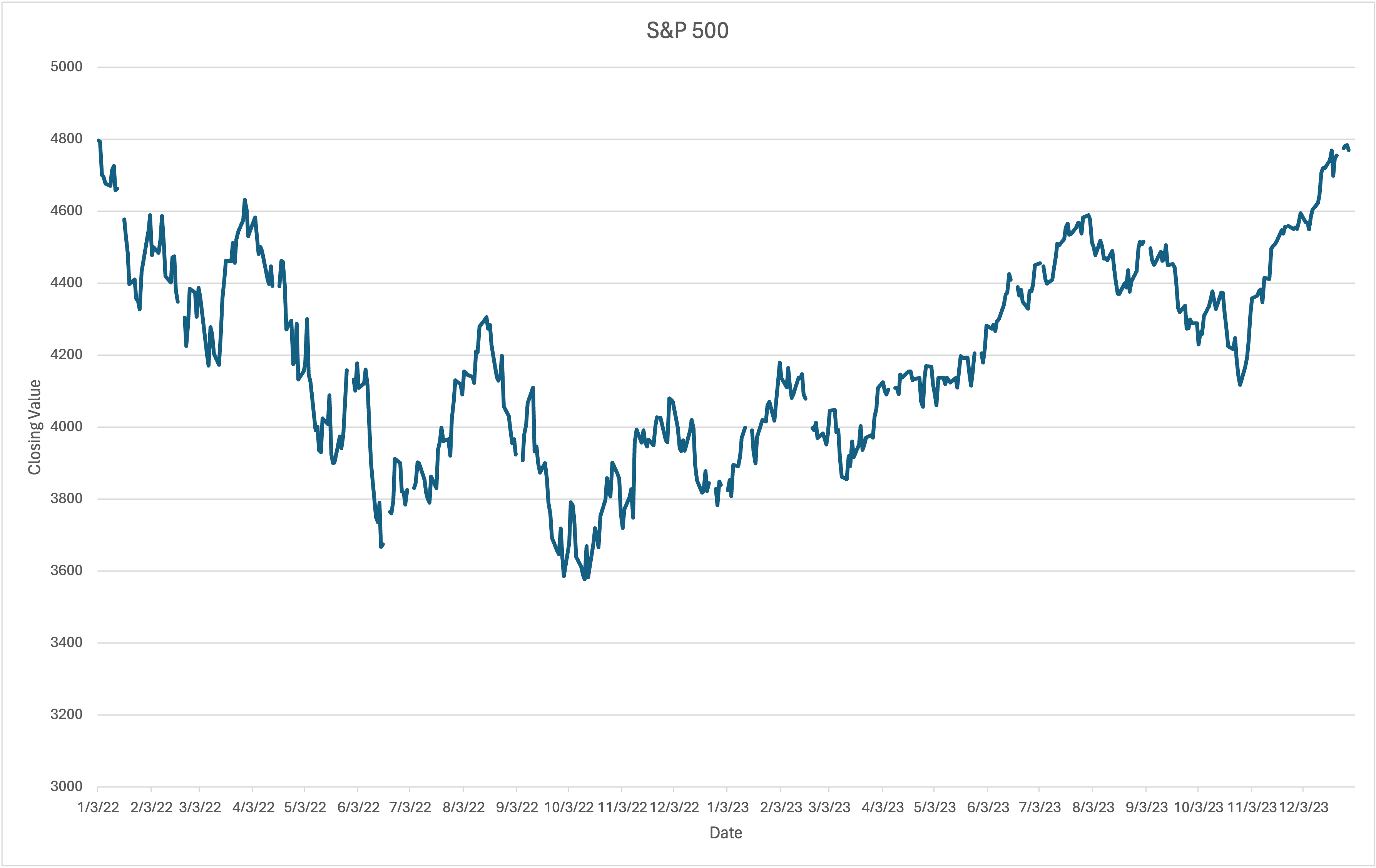
You can see by looking at the line how the trend has changed. If you have the numbers in front of you, would you necessarily be able to tell those changes? Probably not.
Keep in mind that not all graphs are always suitable for one particular variable. There’s a difference between nominal and ordinal data, and what they actually represent.
Bar graphs are best suited for nominal or ordinal variables. With bar graphs, the different values appear on the horizontal axis.

This axis is labeled with the units of the variable for each value. The height of the bar indicates how often each value appears in the data. The vertical axis is labeled with how often values can appear. Columns in a bar graph do not touch one another.
Take a look at this bar graph of human blood types, A, B, AB, and O. What if you took a survey of people and figured out how many people have a particular blood type?

These values are arranged on the horizontal axis, which is labeled as blood type. You can see how high the bars reach for each one of them. It’s obvious using a bar graph that the most common blood types are going to be either A or O. The number of people is found on the vertical axis. Of the 43 people that took the survey, 17 have type A, 5 have type B, 3 have AB, and 18 have type O. That’s indicated on the bar.
Recall from previous lessons that there are two types of scales of measurement regarding interval and ratio variables. A variable has an interval scale if it provides numbers so that the difference between two values can be measured. The difference between any two values can always be determined the same way.
A variable has a ratio scale if it is an interval variable where the only difference is that a value of 0 doesn’t mean that something does not exist. Much like bar graphs show data from nominal and ordinal variables, histograms show the data for interval or ratio variables. With histograms, the different values appear on the horizontal axis, which is labeled with the units of the variable.
The values are divided into ranges, meaning that we divide the data groups with each group having a value where it starts and a value where it ends. For each range, the height of the bar indicates how many values fall on each range. The vertical axis is labeled with how often values can appear in each range, and unlike a bar graph, the bars on a histogram do touch one another.
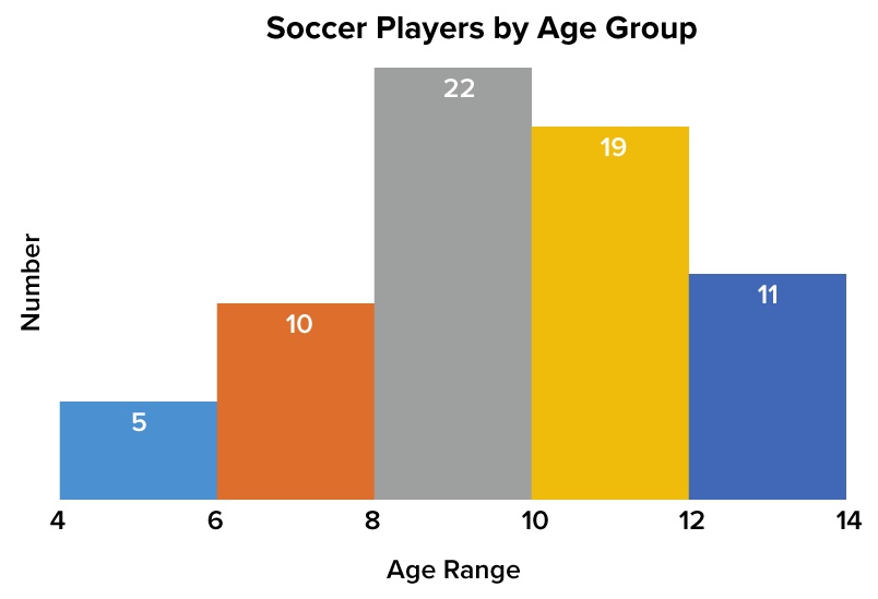
This graph shows youth soccer players that are sorted according to age group. It starts at the low end at the age of 4 and works its way up to the higher end at the age of 14. Each individual bar that you see here represents the number of players that fall between a particular age.
For those between the ages of 4 and 6, there are five players. Between the ages of 6 and 8, there are 10. Between the ages of 8 and 10, there are 22 players. Between the ages of 10 and 12, there are 19 players. Between the ages of 12 and 14, there are 11 players. What does this tell us?
The height of each bar tells you how many people fall into each individual range. The vertical axis is what tells you that, whereas the horizontal axis shows you the different ages considered in this case.
Line graphs are used to track an interval or a ratio variable over a period of time. With line graphs, much like the example with the S&P 500, the time when each value was observed appears on the horizontal axis. This axis is labeled with units of time, such as days or weeks.
The different values of the variable appear on the vertical axis, which is labeled with the units of the variable. Each value is plotted as a point, and the points are connected by lines.
What if you’re interested in how much snow was on the ground at a ski resort throughout the first 15 days of February?
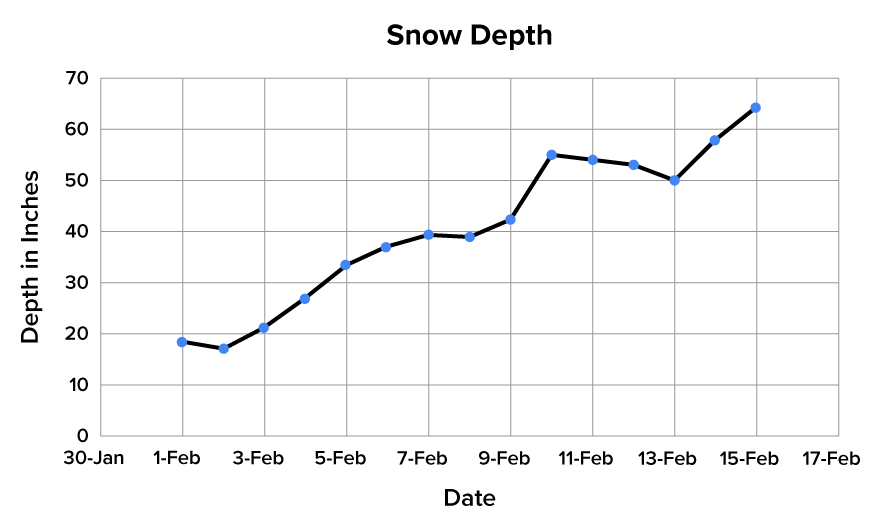
The horizontal axis is labeled with the dates. The vertical axis is labeled with how many inches of snow are on the ground. Each point represents a particular value at a particular time on a particular day.
One of the goals of statistics is to determine if a cause-and-effect relationship exists between two variables. A scatterplot shows a possible relationship between two variables.
It’s often thought that the amount of work experience an employee has contributes to their income. While the scatterplot below does show a positive relationship between years of experience and annual income, it does not necessarily prove that one causes the other. Scatterplots such as this are used for two related interval or ratio variables.

By having two related variables for each observation, two numbers are recorded. The first number, which is for the first variable, appears on the horizontal axis. The second number, for the second variable, is shown on the vertical axis. These axes are labeled accordingly. For each of the two related numbers, a point is plotted.
Look again at the graph of income and experience. You’re looking at information regarding 22 randomly selected employees. The horizontal axis shows how many years of work experience they have. Their income in thousands of dollars per year is on the vertical axis. You’ll notice by looking at these points that a general trend appears. There is a positive relationship between the amount of work experience an individual has and their actual income.
Take a look at another scatterplot.

This hypothetical business tracks the number of customers that walked in their door on a given day of the month. In a case like this, you would expect there to probably not be any kind of correlation between these two variables. The scatterplot here indicates that.
Source: THIS TUTORIAL WAS AUTHORED BY DAN LAUB FOR SOPHIA LEARNING. PLEASE SEE OUR TERMS OF USE.