Table of Contents |
Histograms are a type of distribution for quantitative data. When you have a quantitative data set, often the values are spread out over a large range of values.
Suppose there's an elementary school class in Muncie, Indiana that chooses to keep track of the high temperature on each of the 180 school days. In Indiana, the temperature can get low in the winter, down to zero degrees Fahrenheit, and maybe near 90℉ at the beginning or the end of the school year.
To understand the overall trend of the data, you might not be interested in every single individual temperature. Instead, you might be more interested in how many days were in the 20℉'s--that is, days that the temperature was in the range of 20℉ up to 29.999℉, or in the 30s℉, 40s℉, etc.
The idea that we can break those temperatures that occur over a wide range into more manageable intervals and categorize them that way is called binning. Binning allows us to make a frequency table out of those categories.
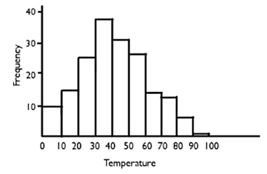
Using the bin width of 10, the Muncie School District recorded the temperature on every day, then categorized them by whether they were in 0℉'s, 10℉'s, 20℉'s, 30℉'s, 40℉'s, 50℉'s, 60℉'s, 70℉'s, 80℉'s, or 90℉'s, and created the following frequency table.
| Temperature | Frequency |
|---|---|
| 0's | 10 |
| 10's | 16 |
| 20's | 25 |
| 30's | 38 |
| 40's | 31 |
| 50's | 27 |
| 60's | 13 |
| 70's | 12 |
| 80's | 7 |
| 90's | 1 |
This means there was one day out of the year that it hit the 90℉'s, seven days were in the 80℉'s, etc. Now we can create a histogram.
A histogram is somewhat similar to a bar graph in that, on the horizontal axis, you’re going to display the temperatures, which are our categories now. The only difference is these categories are numbers. Our bins go from 0 to 10, 10 to 20, 20 to 30, 30 to 40, etc. so it makes sense that we would put 0 as being first, and ten as being second, and 20 as being third. The frequencies, just like a bar graph, will go up the vertical axis.

As you can see from this histogram, the first bin goes from 0 degrees to 10 degrees, and ten days fall into that category. The second bin goes from 10 degrees to 20 degrees, and because there are 16 days there, that bar goes all the way up to 16. Every bar reflects the data from the table.
The way we choose to bin data can change the look, and at times, the shape of the histogram.
In the original histogram, data was classified by 10's. But what if you chose to classify it by 5-degree intervals instead? Instead of going 0℉ to 10℉, what if we split up the values between 0℉ to 4℉ and 5℉ to 9℉, 10℉ to 14℉, and 15℉ to 19℉, etc.? In that case, the bins might look different.
Reviewing the frequency table, there are ten days in the range between 0℉ and 10℉. Suppose there were four days between 0℉ and 4℉, and six days were between 5℉ and 9℉. Therefore, we took one bin and split it into two bins. If you do that with every one of your bins, you end up with twice as many bins and twice as many bars on your histogram.

In this new histogram, notice the frequencies. The bars are not as tall as they were before, but they still provide the same overall shape. However, there are not very many bars overall. There's a lot of data in one part of the graph and not a lot in the other parts. You'll note that in the 90 to 95 bin, there's no bar. The reason for this is that when we broke up that bar, the one data value that was in the 90's was actually in the 95 to 99 range. When there's no data in a particular bin, there's not going to be any bar that extends up from the x-axis.
There are two main problems you may have with binning:


You might confuse a bar graph with a histogram from time to time. However, there are two key differences between the two kinds of graphs.
| Histograms vs. Bar Graphs | |
|---|---|
| The bars touch in a histogram. | This it makes sense because the bins run one into the other, like with the temperature example. The information goes right from the 0's into the 10's, so it makes sense to have the bars right next to each other. In a bar graph, bars don't have to do that. |
| The order of the bars matter in a histogram. |
In a bar graph, typically, there's no reason to believe that one category has a higher value than the other. Suppose that you have a bar graph of the number of students enrolled in different college majors. There's no reason to put economics further to the right than chemistry because one is not numerically greater than the other. However, in a histogram, the values further to the right are, in fact, numerically greater than the values to the left. Because histograms deal with higher numbers and lower numbers, the order of the bars does matter. |
Source: THIS TUTORIAL WAS AUTHORED BY JONATHAN OSTERS FOR SOPHIA LEARNING. PLEASE SEE OUR TERMS OF USE.