Table of Contents |
Sometimes people create graphics that make you want to think a certain way. They're essentially trying to sway you to believe something, so they'll distort information or create misleading graphics to try to persuade you to think that way.
Graphs can be distorted or misleading in a variety of ways.
EXAMPLE
Suppose three friends--Paul, Hector, and Juan--were looking at the number baseball cards they had and created the graph below. Do you notice anything misleading about this graph?
Therefore, some graphs are drawn with unequal scales to represent things disproportionately.
EXAMPLE
Consider this presentation of data about the preferred brand of dish soap. The data states that 15 people selected Brand A, 8 people selected B, and 20 people selected C. Both of these graphs can show us that.| Graph 1 | Graph 2 |

|

|
Another consideration if you use a bar graph or a histogram is that it is a good idea to start the vertical axis at zero unless there's a good reason not to start there.
EXAMPLE
If you were tracking the change in home prices starting from zero and going all the way up to $300,000, the graph won't show a big difference between $300,000 and $280,000. However, to the homeowner, that drop in $20,000 is significant.Graphs beginning anywhere besides zero tend to exaggerate differences. But graphs starting at zero sometimes can minimize very real differences.
Pictographs are plots that use pictures instead of dots or bars. Pictographs show up in newspapers a lot because they're very visually appealing.
EXAMPLE
Suppose that a class of 17 students is asked to name their favorite sport. One student might have drawn this graph to illustrate the results:

The only problem with pictographs is that sometimes they can be misleading. In the figure below, the USA had the most medals, and Russia had the next highest amount.

However, it's not really clear what one medal icon actually means in terms of relative size. What we see is that if you divide 1,975 by six medal icons, one medal icon counts for about 329 medals for the USA.
But if you divide 999 by 5 medal icons for Russia, one medal icon actually counts for about 200 medals for Russia.
In fact, none of these are very consistent.

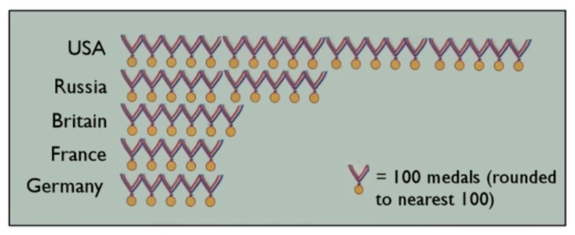
What we should have done is chosen a medal icon to represent a certain, defined number of medals and then extended the ribbon out that far. A better-looking pictograph would be something like this:

Here, the medal icon represents 100 medals and the results will be rounded to the nearest 100. This lines up 20 medals for the USA because the nearest 100 would be 2000. Russia would have half as many medal icons to represent their 999 medals. This shows much more accurately how many more Olympic medals the USA has than the other countries.
It's important to know what you're trying to emphasize and not create perceptual distortion. The images you use to represent bins in your graphs can also distort meaning.
EXAMPLE
Suppose a class of 18 students was asked their favorite sport. Three kids said soccer, five said baseball, and the remaining said basketball. A student drew this graph based on the results:


To make matters worse, technology has introduced us to lots of different misleading graphs, like the one below:

While it is clear that this graph is meant to show data across four different cities, it’s unclear what it's supposed to be measuring because there is no label. Even if we know that this graph is supposed to show how these different markets are doing across time--maybe one of these shapes is meant to represent a store?--it's still unclear what this is supposed to be measuring or what the numbers 0 through 100 actually mean.
The additional problem comes from the lack of clarity about what the graph is comparing. Is it comparing the height of these things or the volume of these things? For instance, a cone only has about 1/3 the volume of a cylinder with the same base and height. Therefore, it doesn't really make sense to be comparing cones and pyramids to cylinders and boxes.
Because the previous graph is three-dimensional, there's no way to easily compare heights. Is the cone supposed to be taller, shorter, or the same height as the cylinder behind it? It's going to be very hard for anyone to tell, which makes this is an incredibly misleading graphic.
Technology, like certain spreadsheet programs, has allowed you to easily create many different graphs. Using so many technological tricks, like three-dimensional cones and cylinders, can distort your data.
The best choice, if you're going to use bar graphs, would be the simple ones, like the simple two-dimensional ones at the top. For the data above comparing the four cities, a better choice would be something like a time series, since this graph is meant to compare across time.

This is a lot more useful to anyone reading it than the previous example. It isn’t as flashy, but none of the information is hidden or distorted.
Source: THIS TUTORIAL WAS AUTHORED BY JONATHAN OSTERS FOR SOPHIA LEARNING. PLEASE SEE OUR TERMS OF USE.