Table of Contents |
You may recall that outliers are values that are far outside the pattern established by the rest of the data. They're either very high or very low in comparison to the rest of the data set.
Boxplots, introduced in another tutorial, are a way to graphically display the five number summary for a data set. This tutorial will present a modified version of boxplots so that it is easier to observe outliers in them.
EXAMPLE
Here is a set of test scores.To make it easier to find outliers, there is a mathematical rule for determining whether a point is an outlier or not. This is called the “1.5xIQR rule.” IQR stands for Interquartile Range.
So, how do you use the 1.5xIQR method?
EXAMPLE
Consider the data set of test scores from above.| 90 | 98 | 89 | 88 | 46 | 90 | 91 | 84 | 94 |
| 46 | 84 | 88 | 89 | 90 | 90 | 91 | 94 | 98 | ||||||||
|
↑ Q1=86 |
↑ Median |
↑ Q3=92.5 |
||||||||||||||


|
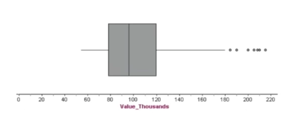
Home Prices in Albuquerque, New Mexico From February - April, 1993 | |||||
|---|---|---|---|---|---|
| 205 | 72 | 93.9 | 99.5 | 87.5 | 105 |
| 208 | 72 | 82 | 97.5 | 88.9 | 104.5 |
| 215 | 74.9 | 78 | 97.5 | 85.5 | 105 |
| 215 | 73.1 | 77 | 90 | 83.5 | 102 |
| 199.9 | 72.5 | 70 | 96 | 81 | 100 |
| 190 | 67 | 62 | 86 | 80.5 | 103 |
| 180 | 215 | 54 | 169.5 | 79.9 | 97.5 |
| 156 | 159.9 | 107 | 155.3 | 75 | 95 |
| 145 | 135 | 210 | 125 | 75.9 | 94 |
| 144.9 | 129.9 | 72.5 | 130 | 75.5 | 92 |
| 137.5 | 125 | 66 | 102 | 75 | 94.5 |
| 127 | 123.9 | 60 | 102 | 73 | 87.4 |
| 125 | 120 | 58 | 92.2 | 72.9 | 87.2 |
| 123.5 | 112.5 | 184.4 | 92.5 | 71 | 87 |
| 117 | 110 | 158 | 89.9 | 77.3 | 86.9 |
| 118 | 108 | 69.9 | 85 | 69 | 76.6 |
| 115.5 | 105 | 133 | 87.6 | 67 | 73.9 |
| 111 | 104.9 | 116 | 89 | 61.9 | |
| 113.9 | 95.5 | 110.9 | 87 | 129.5 | |
| 99.5 | 93.4 | 112.9 | 70 | 97.5 | |
| Q1 = 78, Q3 = 120 | |||||


You can use this new information to create a new version of an already existing plot that you have. You’ve made boxplots in another tutorial; now you can modify them to show outliers.
Generally, you would make the whiskers on the box-and-whisker plot extend all the way out to the maximum and minimum. If the minimum or maximum (or both) are outliers, that will make the whiskers really long. For a modified boxplot, instead of going all the way out to those outliers, you can extend them only to the highest and lowest values that aren't outliers and notate the outliers separately.
EXAMPLE
Refer back to the student data set from the section above. Here are the values from least to greatest.| 46 | 84 | 88 | 89 | 90 | 90 | 91 | 94 | 98 | ||||||||
|
↑ Q1=86 |
↑ Q3=92.5 |
|||||||||||||||


Source: THIS TUTORIAL WAS AUTHORED BY JONATHAN OSTERS FOR SOPHIA LEARNING. PLEASE SEE OUR TERMS OF USE.