Table of Contents |
Now that you have some basic understanding of data and how it is measured, it is important to know how the data is distributed. Simply knowing the mean, median, or mode is generally not sufficient to explain much about the data. Knowing just how much the data strays away from those measures is important as well.
Knowing how data is distributed allows us to make predictions about what to expect and what not to expect for a given data set. Graphically, smooth curves, called density curves, can be used to show the distribution of variables. Look at the graph shown here. Notice how the curve is smooth and shaped like a bell.

What’s useful about a density curve is that it shows how often a given value was recorded. What happens to create this curve is that a large number of observations are taken, and how often they happen is plotted out. Eventually, you’ll get a shape that resembles a bell.
Take a look at this curve that represents IQ scores, which are a measure of intelligence. The horizontal axis represents the actual score. Notice that the bell-shaped curve is drawn above the horizontal axis. It’s centered at 100, which is the average IQ.

The range of this bell-shaped curve goes from 40 at the low end to 160 at the high end. This type of curve is called a normal distribution curve, and they occur quite often in many different situations.
This next graph represents the time spent on social media per day by teenagers. It is another bell-shaped curve. You can see that the average, or the mean, is centered at 500 minutes per day. The range is 200 to 800 minutes per day. The total number of hypothetical teenagers surveyed is 10,000. This large number of observations is necessary before real data will take on the characteristic smooth and uniform normal distribution curve.

Notice how a large number of observations are concentrated more toward the center. When you’re looking at normal distributions, they all have density curves that are symmetric and bell-shaped. The mean, median, and mode of the normal distribution are all the same and equal to the center value of the density curve, which in this case is 500.
Check out a distribution curve for the height of college basketball players indicated in this graph:

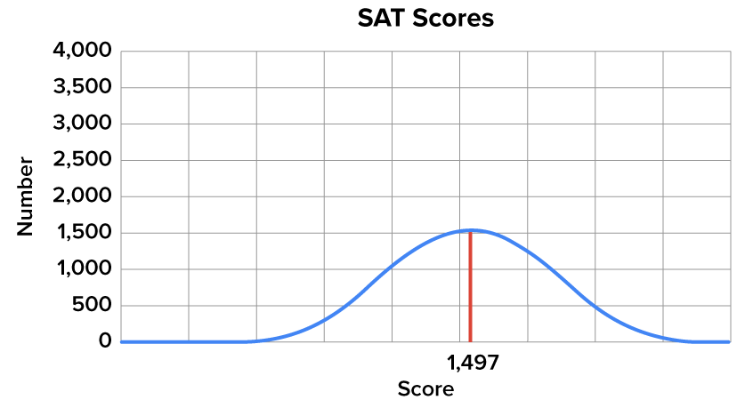
Now here’s a distribution of SAT scores. The average in this case is 1497, which was actually the average SAT score in the year 2012. Notice how this curve deviates a little further from the mean, median, and mode. The curve looks a little flatter in this instance, with a wider distribution with regard to how the observations actually fall.
Source: THIS TUTORIAL WAS AUTHORED BY DAN LAUB FOR SOPHIA LEARNING. PLEASE SEE OUR TERMS OF USE.