Table of Contents |
Everything you've learned about type so far can be applied to many products, like books, websites, newspapers, and magazines. Knowing all these concepts and applying them together, as opposed to looking at any one concept by itself, gives you a strong foundation in analyzing type in visual design.
Every magazine, for instance, has its own design language, and the type characteristics and components you've learned are what help designers think of creative ways to put type to use.
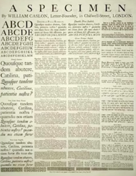
Prior to creating a design, designers often spend time reviewing type families and visualizing how they can enhance their design and visual message. Designers do this with what is called a type specimen.
Below is what a type specimen looks like. Basically, it's a sample page of a particular typeface shown in a variety of sizes and linespacing.

To the untrained eye, this might just look like a bunch of garble from an old newspaper; however, it can show you a variety of sizes, postures, and linespacing for a particular typeface.
It's really easy to find type specimens on websites, like this particular site.

A type specimen is incredibly useful because it lets designers see how they could use the same typeface across a design to provide a unified look.
If you take a look at this Popular Science magazine cover from 1964, you can see that, aside from the heading, the majority of the white typeface is the same.
However, the typeface is used in different positions and different sizes to provide information while still presenting a unified look.

A lot that of what you've learned is being displayed here. The typeface is chosen to be used as a header because it holds more weight. Serif is used to ground it to the page, and it's more legible from afar.
But you might have noticed that the P is a little off. Maybe that can be fixed with a bit of manual kerning.

The header now feels more balanced.
Below is a spread from Time Magazine. You can see the large headline text; the image is difficult to read, but you can still see that large capital letter being used to start off a sentence.

You can also see the columns, which are divided by alleys. The gutter dividing the two pages provides a clear separation from page to page.
Additionally, you'll notice that the text is justified. This makes it easier to read because it flows from left to right, as opposed to being center aligned or right aligned. In the end, you get a nice-looking spread that's easy to read, with a functional design language.
The image below is a movie poster, and it shows how important type can be in creating a brand, or something recognizable that you will associate with the movie.

You can see that the main header reading "Transformers" is a bit more decorative—definitely not a type that you'd find in a book.
Notice the tracking of the lines of the text below "Transformers." There's more space between each letter in "Dark of the Moon," as well as in "July 1, 2011." Selecting line spacing, typeface, and posture is very important because they direct eye flow.
"Transformers" has the most type weight; then, for the most part, your eye flows below to "Dark of the Moon." This is smaller in size, but the proximity is right below the headline. Then, your eye continues down towards the date, and then, you might go back to the very top where there is compressed text that reads "a Michael Bay film."
Or maybe you started there first, and then you made your way down. Either way, the headline demands the most attention, so that's where your eye tends to go.
It's easy to dismiss type as boring or unimportant compared to painting or graphic design, but type can be used for creative design as well.
Below is a simple but beautiful design made entirely out of type.

This designer used a variety of typefaces and weights from different specifications, but used them in a way that creates a visually-stimulating piece while retaining visibility.
You can still examine the words individually, which all have to do with biology. It takes a lot of skill, but it is possible to use a variety of typefaces while creating a harmonized space.
Below is a movie poster for Titanic that is very type-centric; it doesn't need an image of a ship at all, or any graphics really.

Type is placed in the right area and in the right size, which tells a story in addition to providing information to the viewer. The poster successfully tells that story without sentences or images, just the use of type and some clever design choices.
Source: THIS WORK IS ADAPTED FROM SOPHIA AUTHOR MARIO E. HERNANDEZ